I have painted a lot of walls. And I can tell you, two tone wall paint ideas changed the way I think about home design.
If your walls feel flat or boring, this article is for you. I will show you 33 color combinations that actually work.
You will also learn how to pick the right colors, avoid common mistakes, and use simple techniques to get a polished look.
I have tested many of these ideas myself. What you read here comes from real experience, not guesswork.
This blog covers color combos by room, style, and mood Painting techniques that add depth tips to avoid costly mistakes.
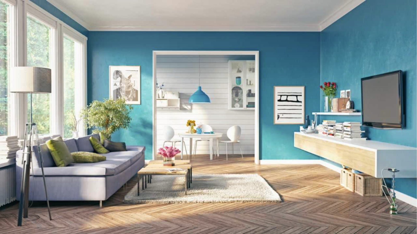
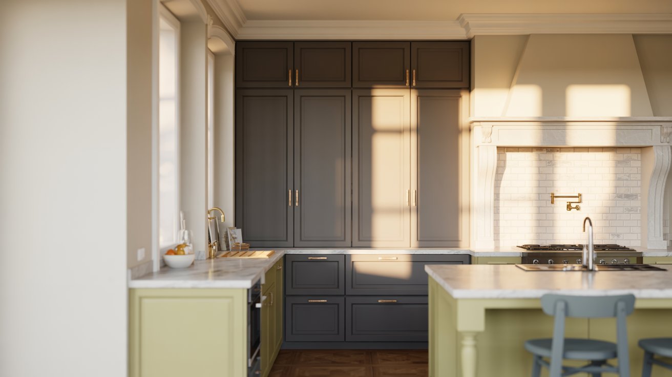
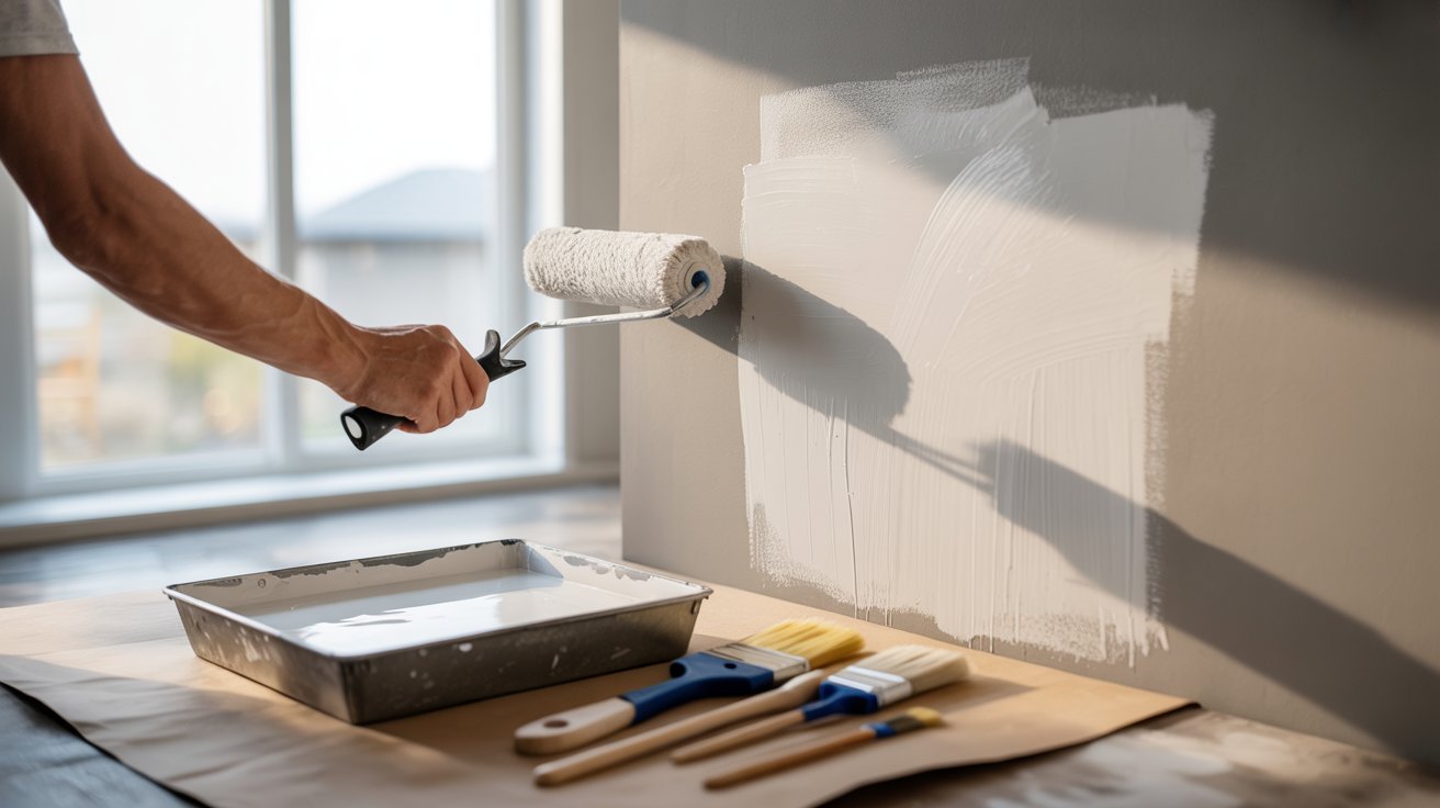
Why Two Tone Wall Paint Ideas Are So Popular in Modern Homes
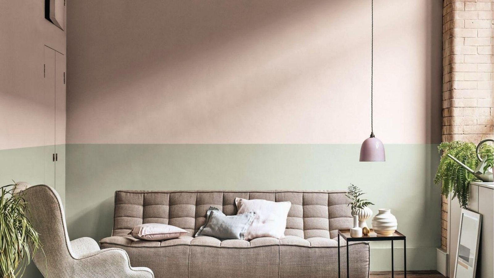
Two tone walls are quickly becoming a go-to choice in modern homes, and for good reason.
They give any room a finished, put-together look by adding depth and breaking up large, flat walls without requiring expensive furniture or major renovations.
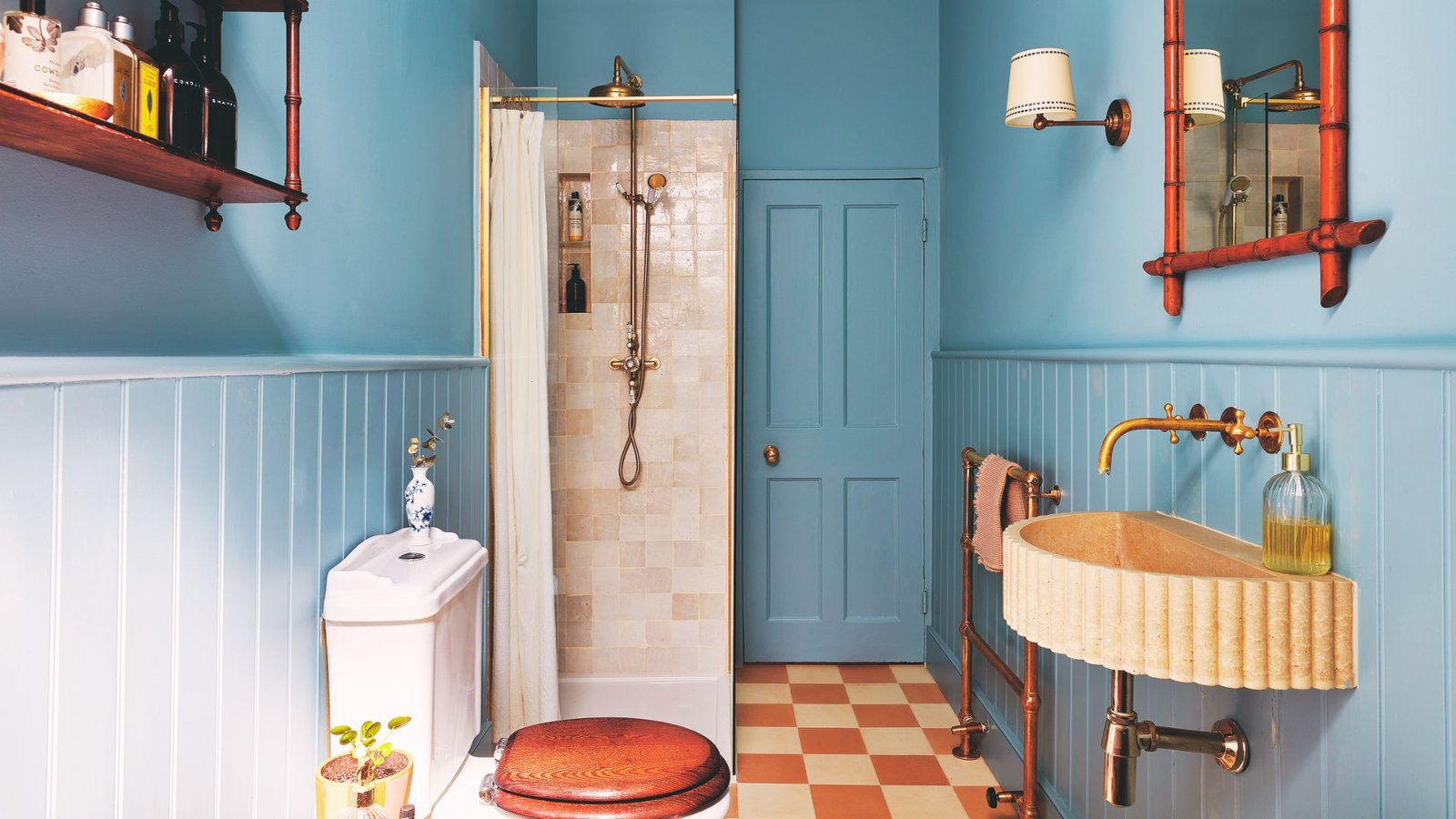
Darker shades on the lower half ground the space, while lighter tones above draw the eye up and make ceilings feel taller, creating a natural focal point that adds real character.
To get it right, start by looking at your existing floors, furniture, and lighting, then pair one neutral with one accent color. Test samples first, and aim for balance over force.
Best Two Tone Wall Paint Ideas for Every Room
Here are some of the most popular and stylish two tone combos you can use in any room of your home.
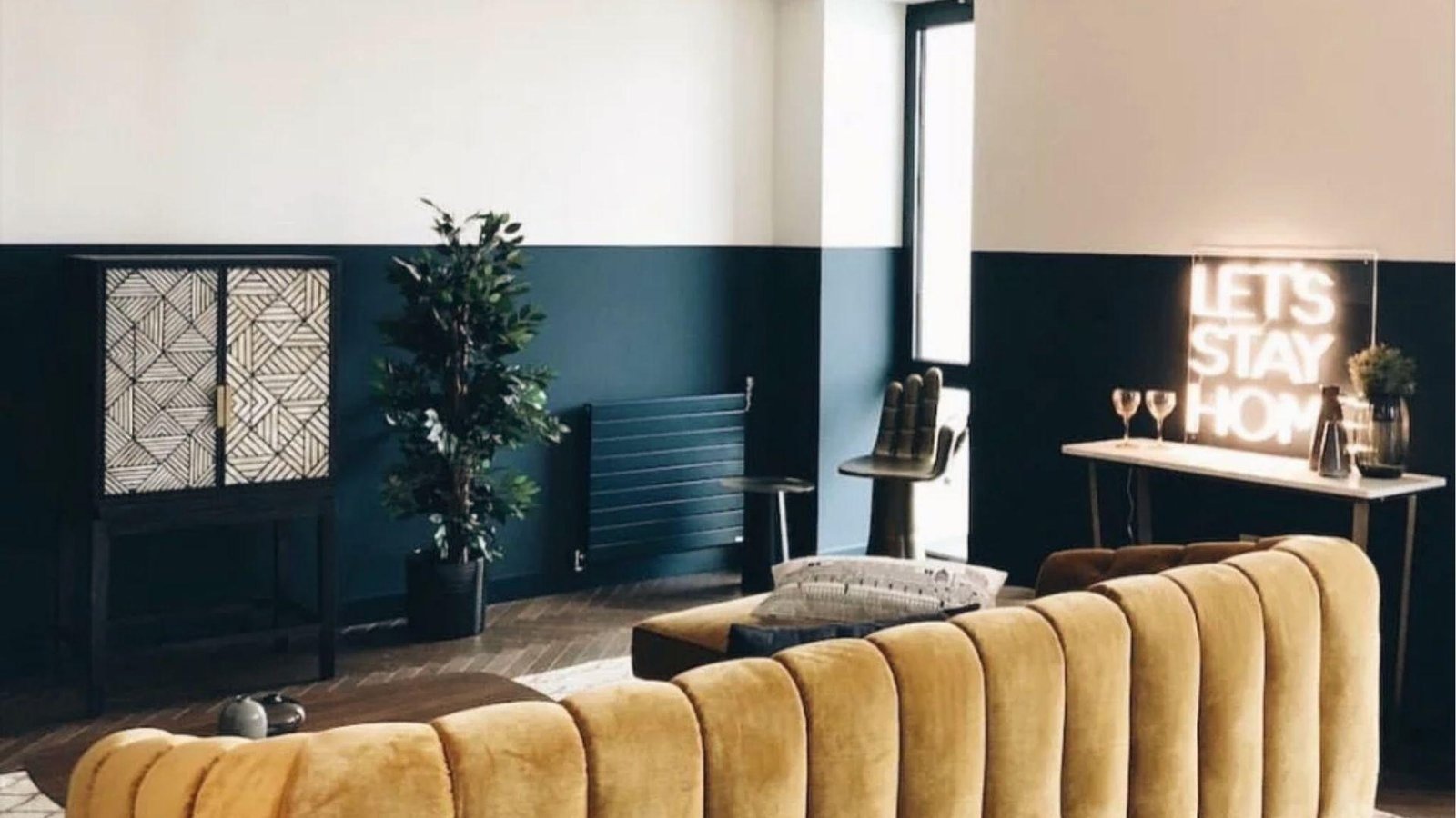
1. Navy Blue and White
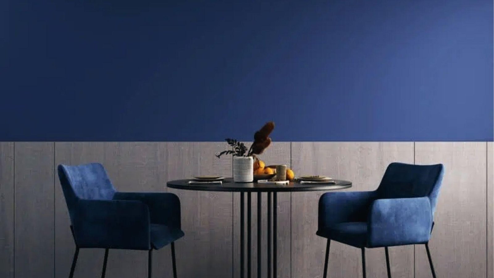
This combo is timeless. The navy on the lower half and white on top feels clean, bold, and modern. Works well in living rooms and bedrooms.
2. Black and White
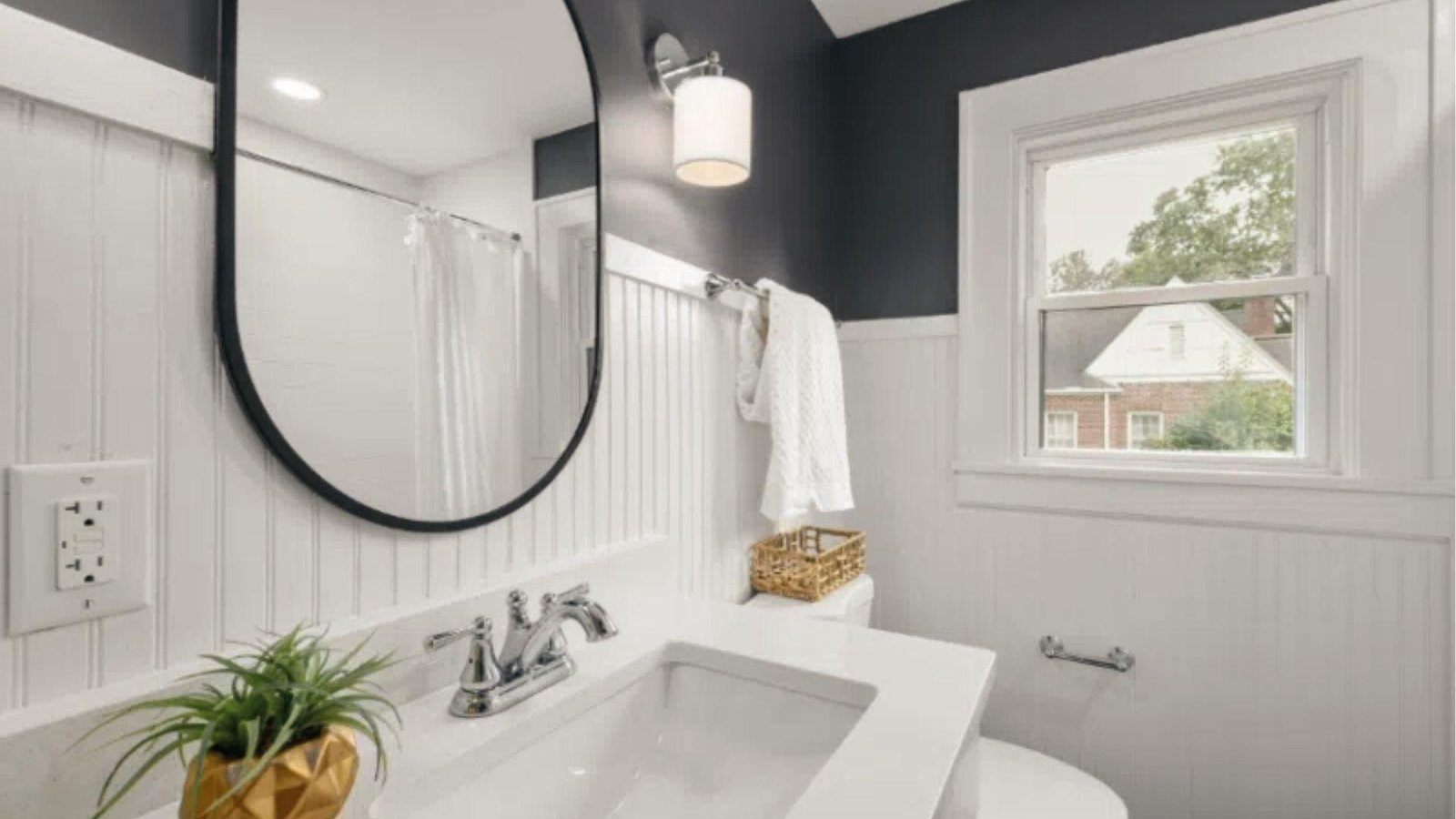
Sharp and graphic. This works best in modern or minimalist spaces where contrast is the goal.
Black on the upper wall with white wainscoting below creates a structured, editorial look that feels intentional and bold.
Keep accessories simple and let the color contrast do the heavy lifting in the room.
3. Beige and White
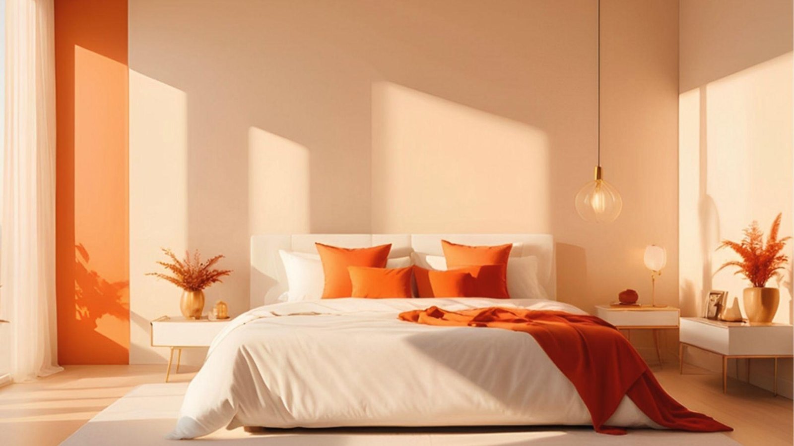
Warm and easy to live with. Great for any room where you want a soft, neutral base that does not compete with your furniture or decor.
Beige brings just enough warmth to stop white from feeling cold, and together they create a layered, livable look.
This combination is especially forgiving in rooms with mixed furniture styles.
4. Brown and White
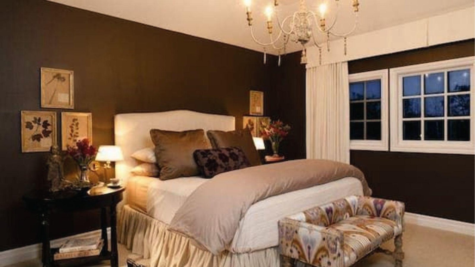
Warm and classic. A solid choice for living rooms and home offices where you want depth without going fully dark.
Deep brown grounds the space while white keeps it from feeling closed in or heavy. It is a combination that works across traditional, rustic, and contemporary interiors equally well.
5. Taupe and Pearl White
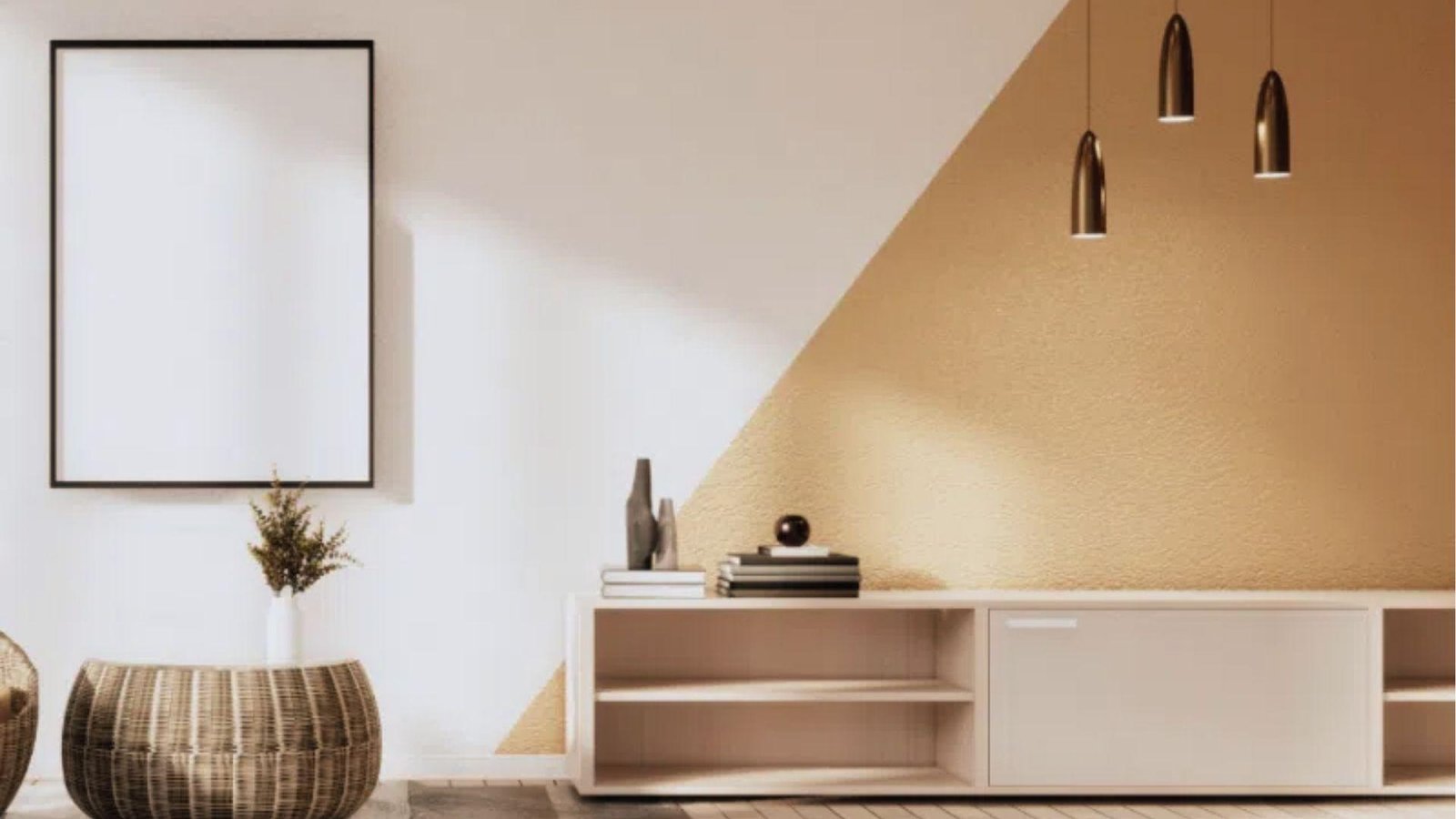
Soft and timeless. A calm, neutral pairing that never goes out of style and works in almost every room type.
Taupe adds a warm gray undertone that gives the space more dimension than plain white alone ever could.
It is a particularly strong choice for open-plan areas where walls need to recede rather than compete.
6. White and Tan
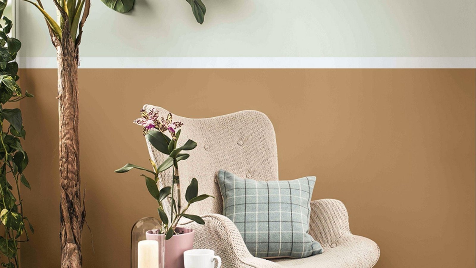
Minimal and warm. Great for rooms where you want the furniture to stand out rather than the walls.
Tan brings enough warmth to make the space feel lived-in without pulling attention away from the pieces you have curated.
This pairing is especially effective in corners and reading areas with natural light.
7. Sage Green and Gray
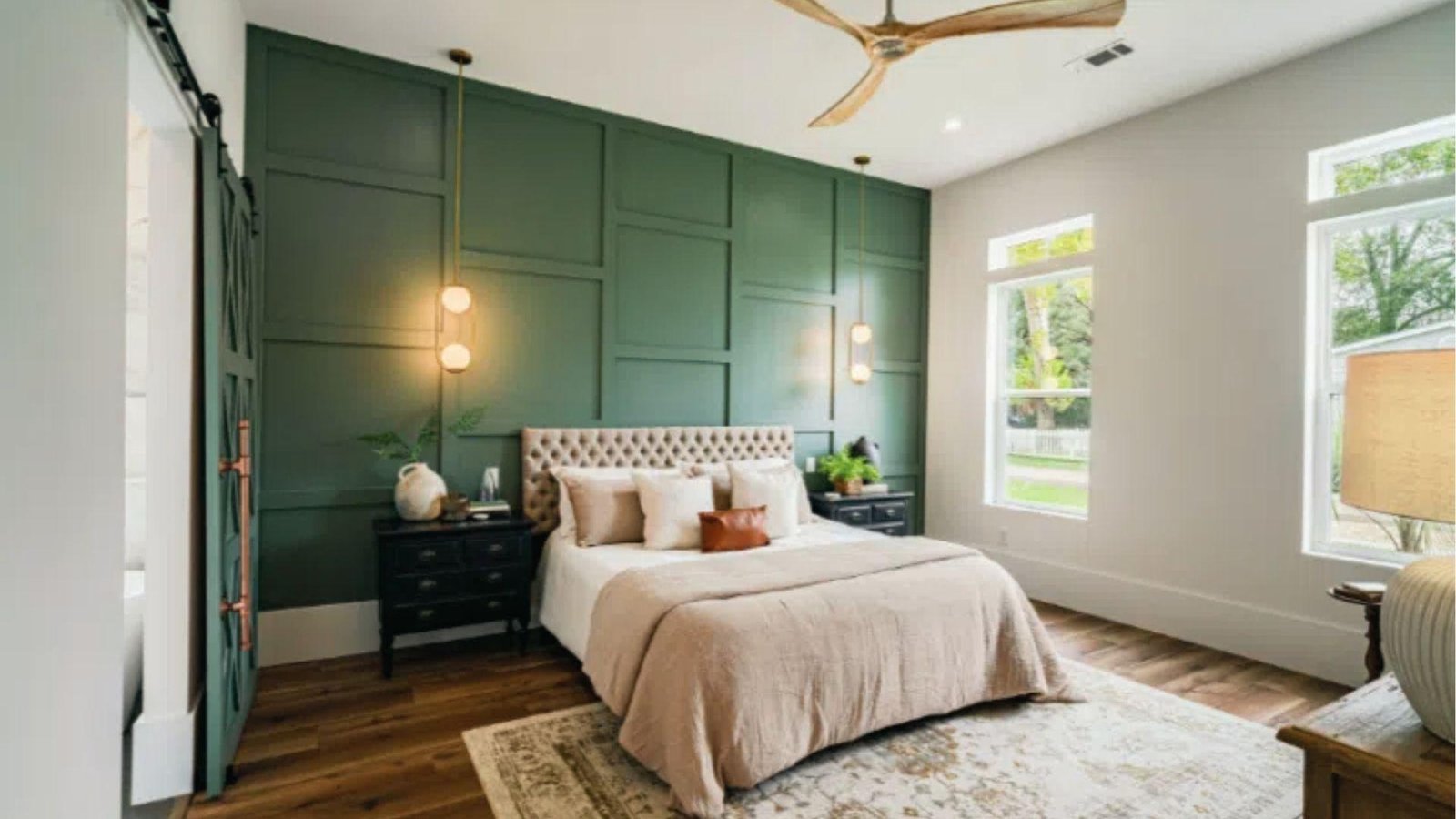
Soft and calming. This pairing suits bedrooms and reading nooks where you want a relaxed feel that holds up through the day.
Sage green brings a quiet organic quality while gray keeps the overall look cool and composed.
Together they create a restful atmosphere that works especially well with wood and linen textures.
8. Emerald Green and White
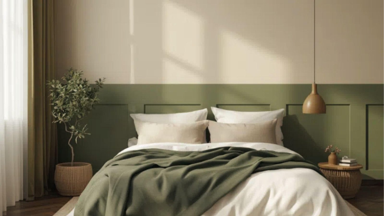
A bold choice. Emerald brings energy to a room while white keeps it from feeling too heavy or enclosed.
Used on lower paneling or an accent wall, emerald adds serious personality without taking over the entire space. It works best in rooms with good natural light and simple, pared-back furniture.
9. Forest Green and Cream
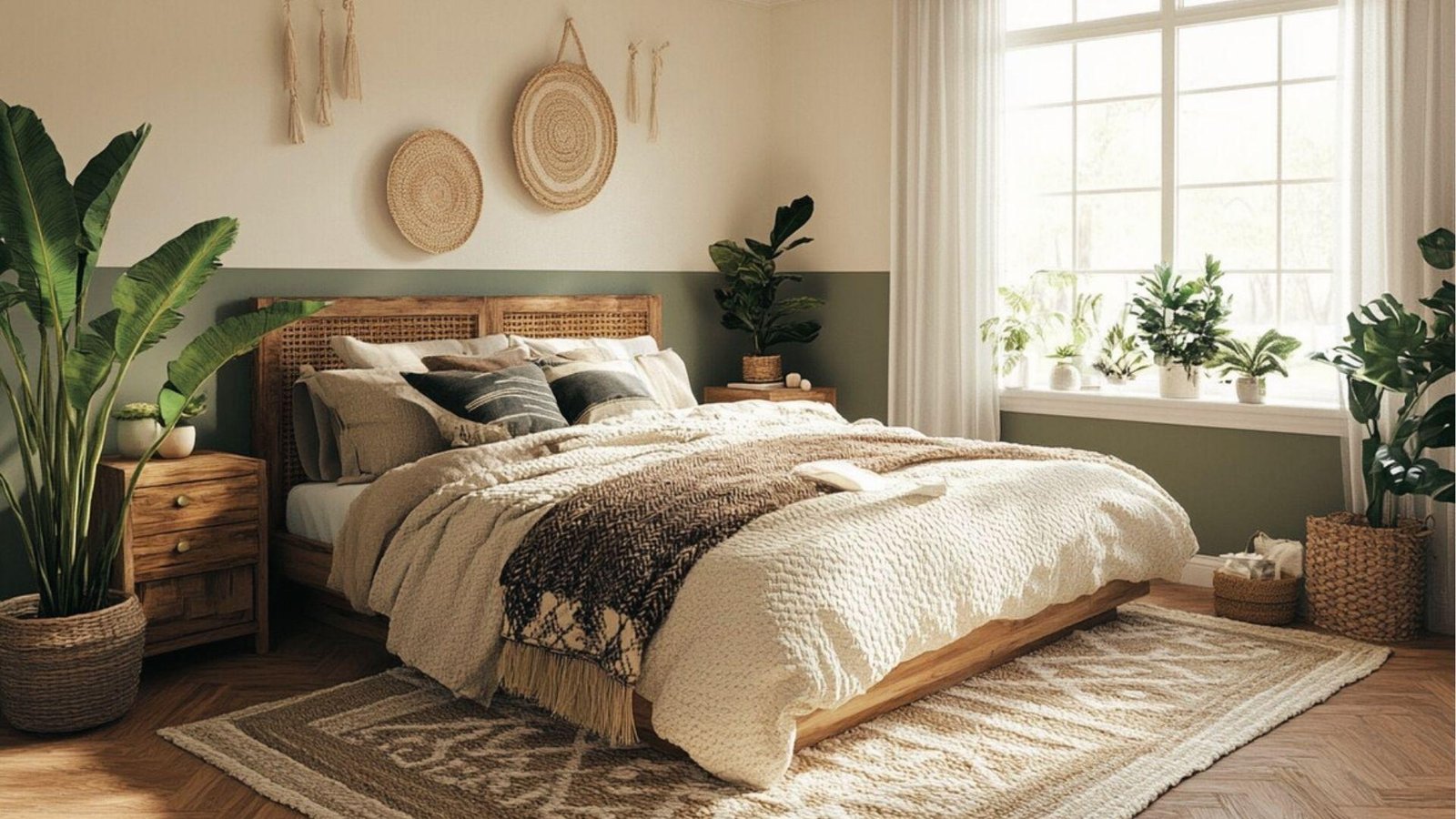
Earthy and grounded. This combo brings a natural, organic feel to any room and pairs exceptionally well with rattan, wood, and trailing plants.
Forest green feels rich and considered rather than loud, especially when set against the softness of cream.
It is a combination that rewards layering with natural textures and warm lighting.
10. Olive Green and White
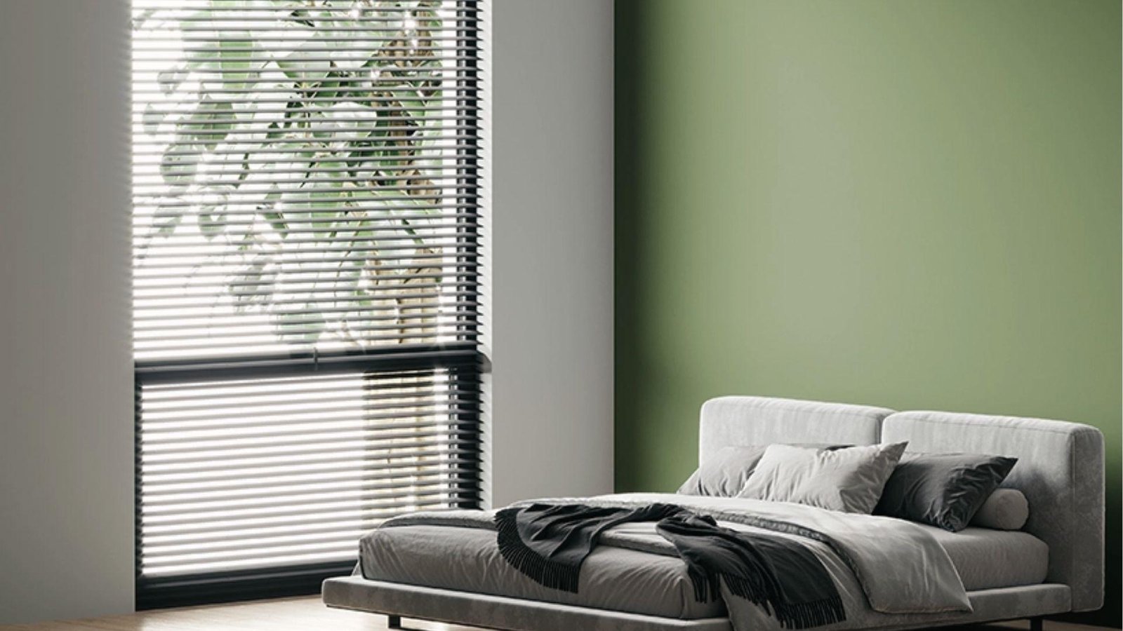
Understated and earthy. A calm pairing that suits both modern and traditional spaces without feeling tied to either.
Olive brings warmth and a subtle depth that brighter greens simply do not have.
It holds up well in rooms with varying light conditions and sits comfortably alongside both warm and cool-toned furniture.
11. Dark Teal and Green
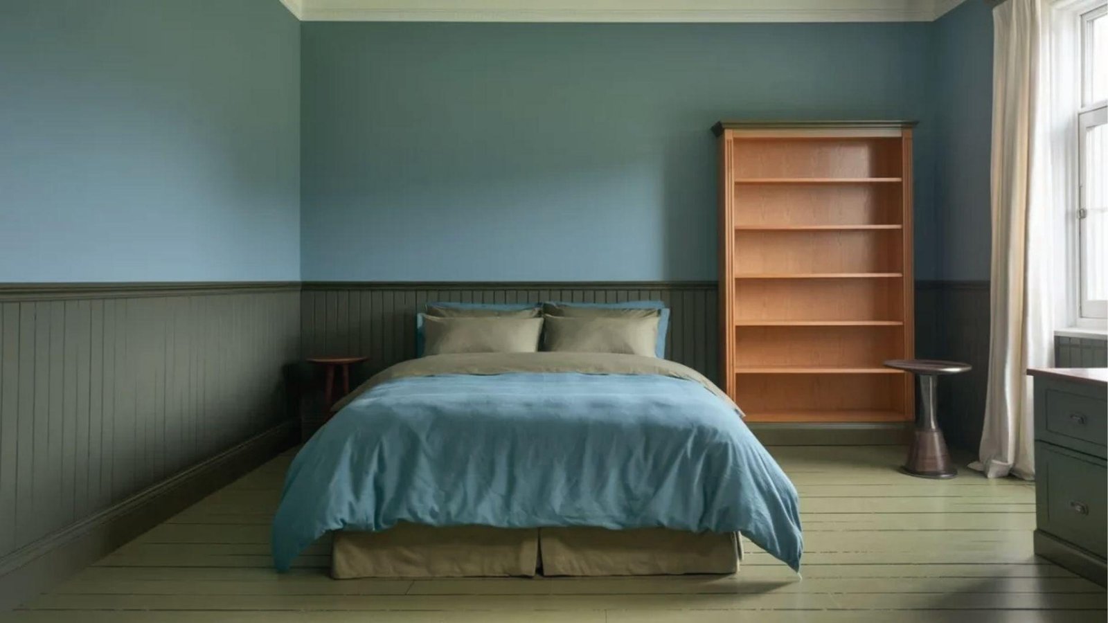
Moody and layered. This combo works well in accent walls or reading rooms where you want atmosphere and depth.
Placing dark teal alongside green creates a tonal richness that feels deliberate and considered rather than overwhelming.
Keep surrounding furniture light or natural to let the wall combination breathe and stand out.
12. Green and Off-White
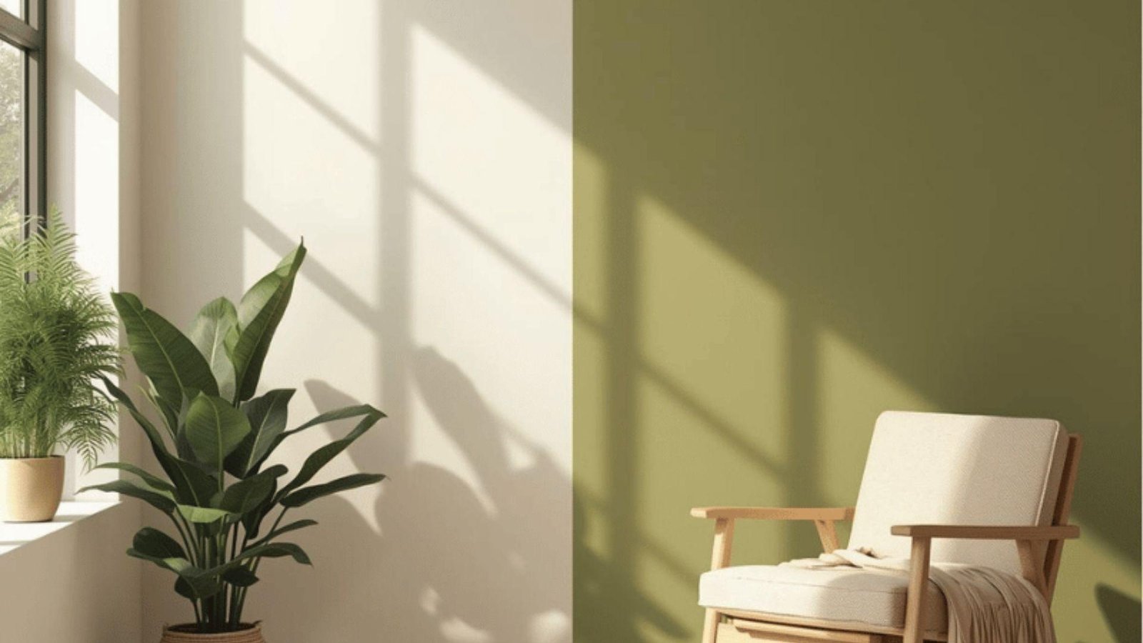
Calming and natural. Suits spaces with wood furniture or plants where a soft, organic palette ties everything together.
Off-white is warmer and more forgiving than bright white, making the green feel grounded rather than sharp.
This is a pairing that works quietly in the background and improves with every natural element you add.
13. Sage Green and Bronze
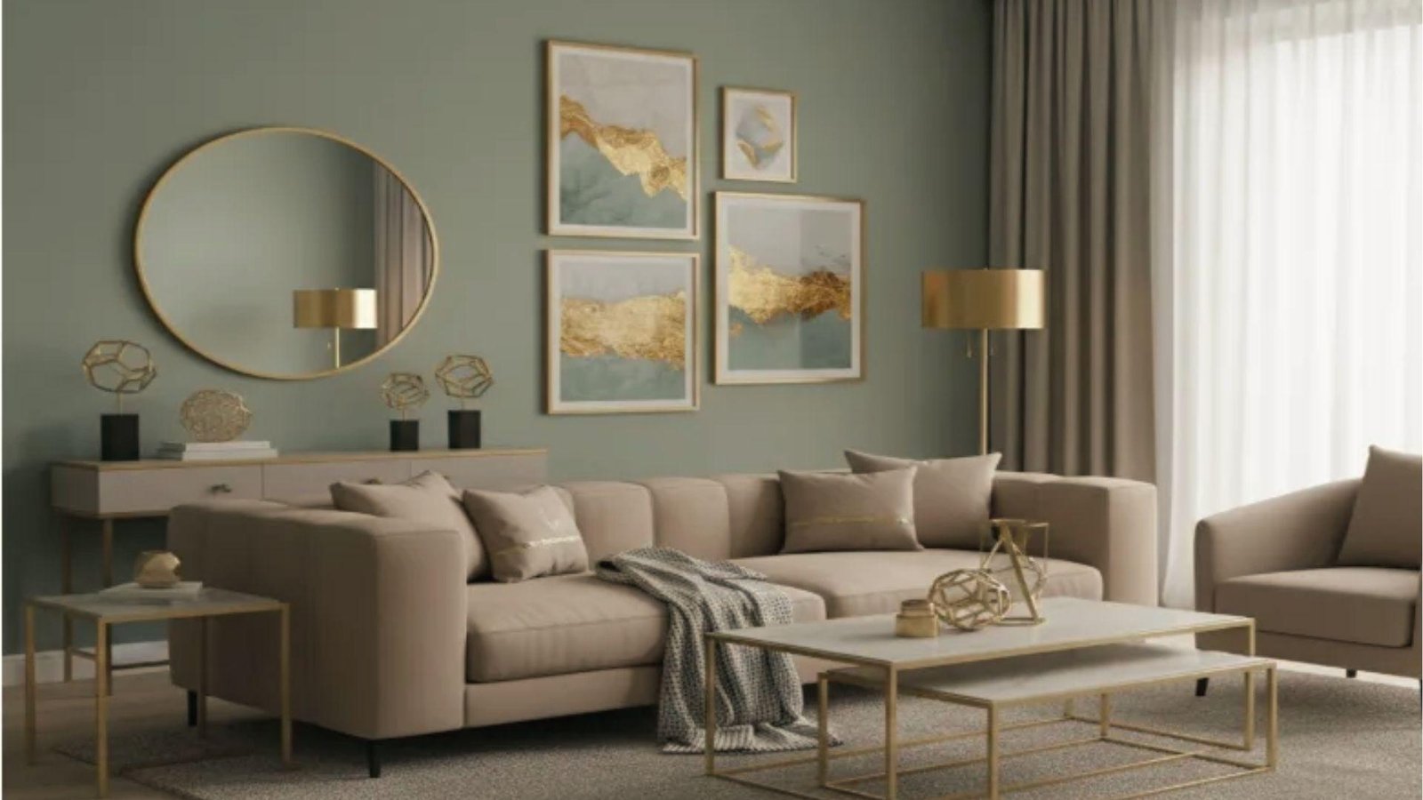
Warm and rich. A great choice for dining rooms or living spaces with warm lighting where you want the room to feel cozy after dark.
Sage green provides a cool, earthy base while bronze accents in hardware or decor bring in a metallic warmth that lifts the whole combination.
Together they create a room that feels considered and genuinely inviting.
14. Light Wood and Forest Green
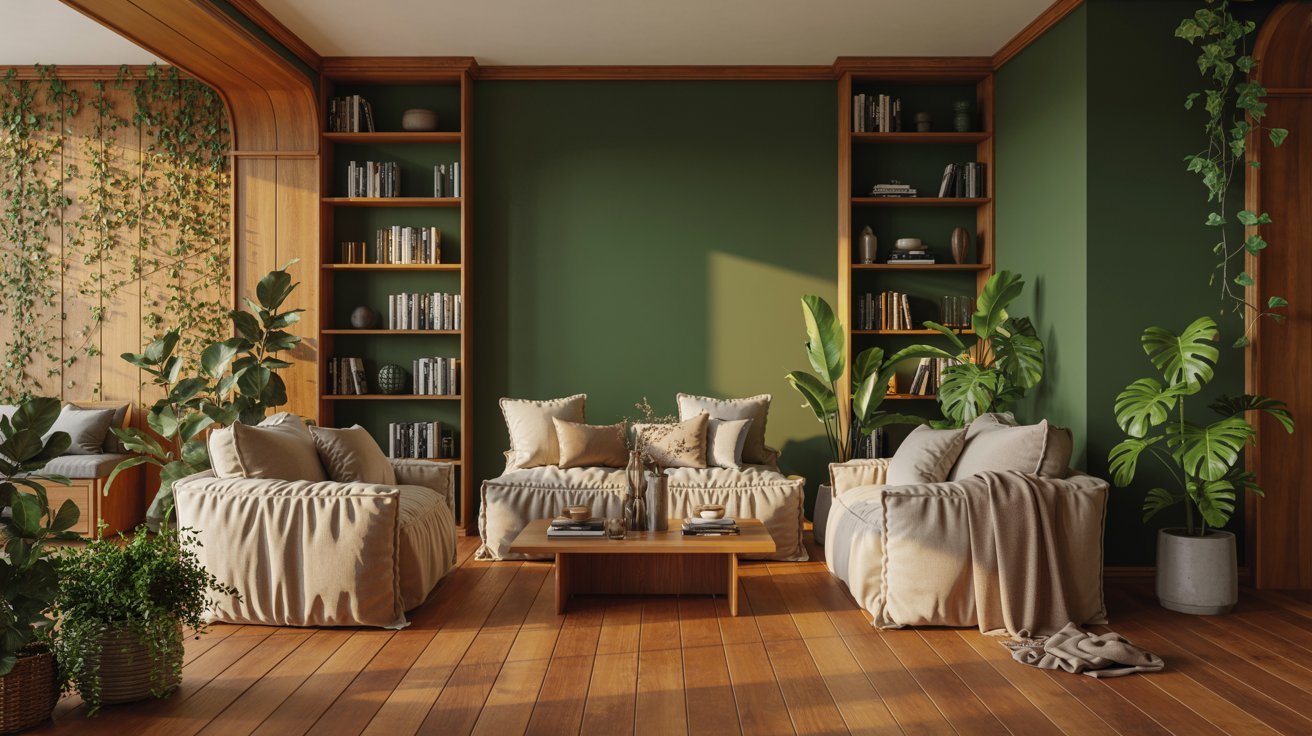
Earthy and layered. This combo brings warmth and a touch of nature indoors.
Forest green on the walls paired with wood-toned trims creates a grounded, cocooning effect that works well in living rooms and studies.
Keep the green deep rather than bright so the result feels rich without being heavy.
15. Yellow and Green
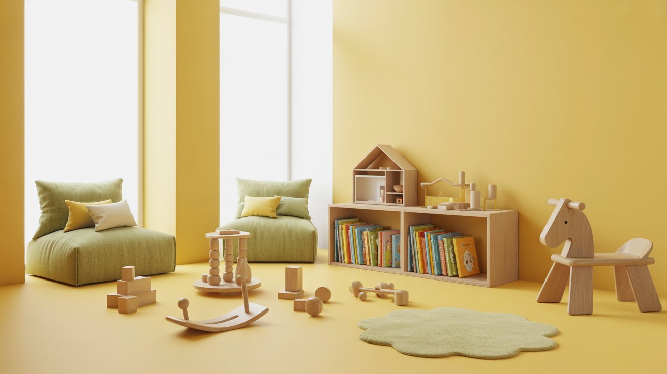
Fresh and energetic. This combination works well in creative spaces or children's rooms where playfulness is welcome.
Use a soft butter yellow rather than neon, and pair it with muted sage green so one color leads and the other supports. Too much saturation from both at once will feel chaotic.
16. Cobalt Blue and White
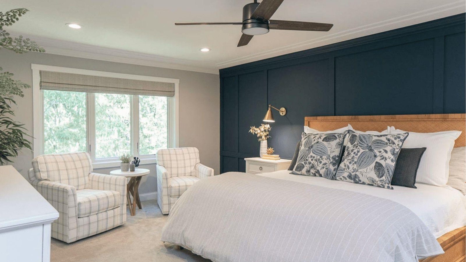
Bright and fresh. This pairing works well in kitchens and bathrooms where you want a lively feel that still reads as clean.
Cobalt on cabinetry or an accent wall against crisp white creates strong contrast without feeling harsh. It is a combination rooted in Mediterranean design that ages very well.
17. Navy and Cream
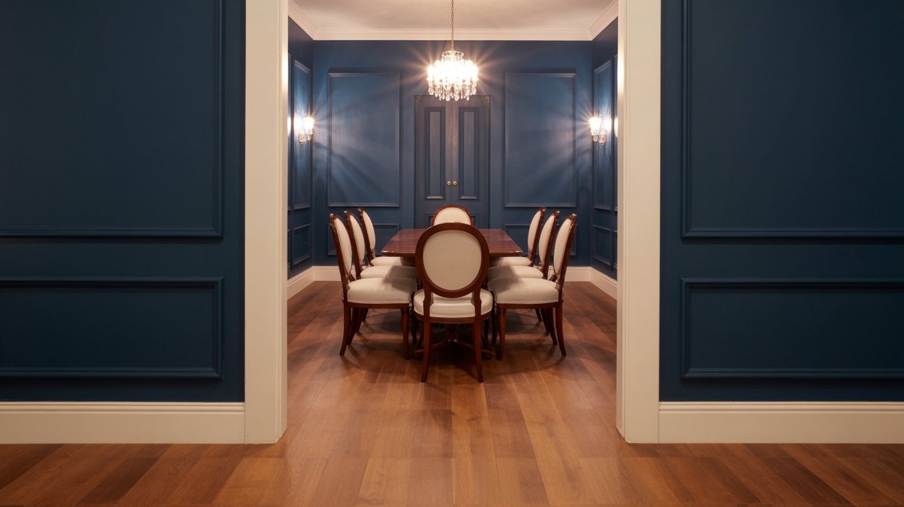
Warm and refined. A softer take on navy that feels welcoming rather than bold. Cream neutralizes the intensity of navy and keeps the room feeling approachable, not cold.
This works especially well in dining rooms, hallways, and any space with warm wood flooring.
18. Sky Blue and Sandy Beige
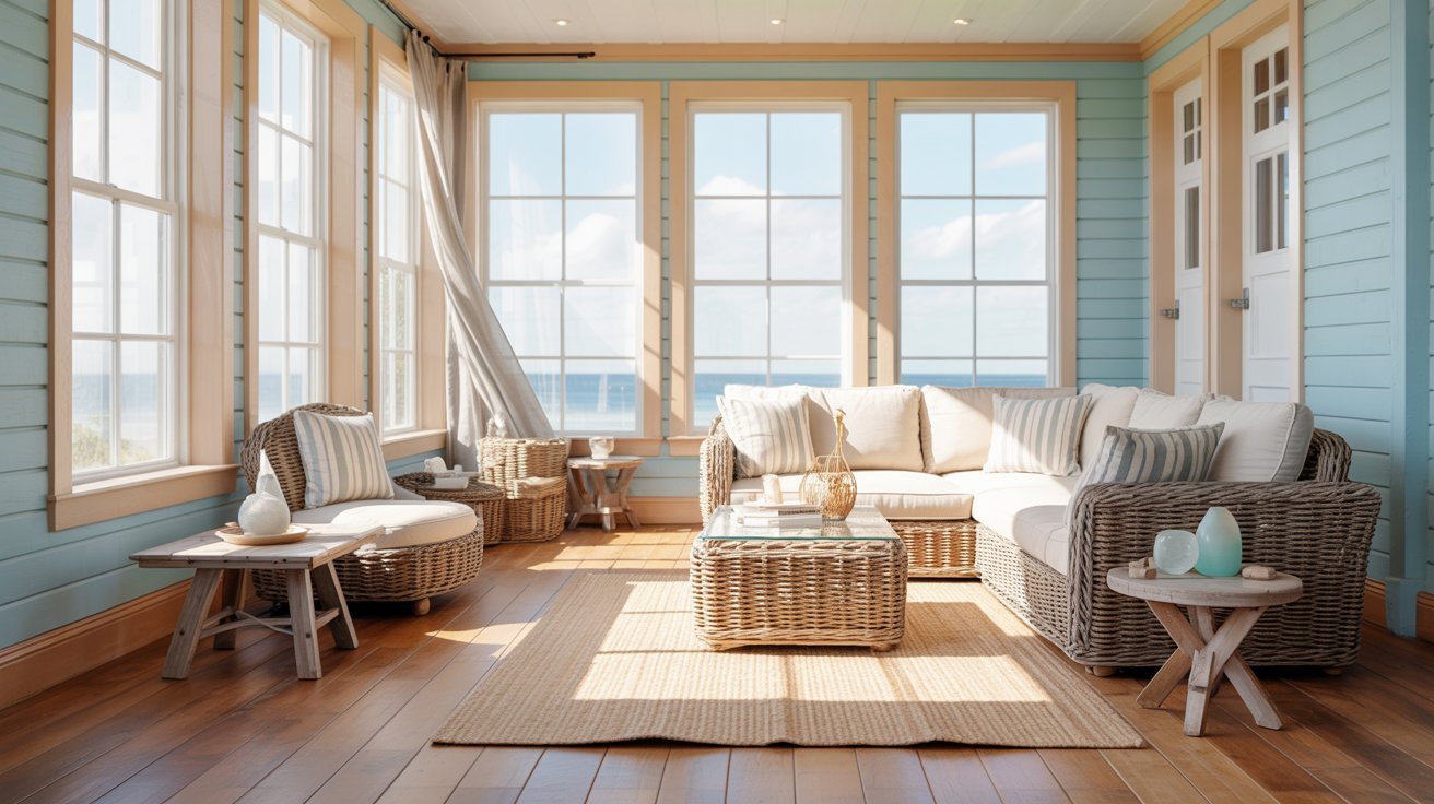
Light and airy. This combo brings a coastal feel to any room without leaning too heavily into themed decor.
The soft warmth of sandy beige stops the sky blue from feeling cold or clinical. It is an ideal pairing for bedrooms and sunrooms with good natural light.
19. Pale Blue and White
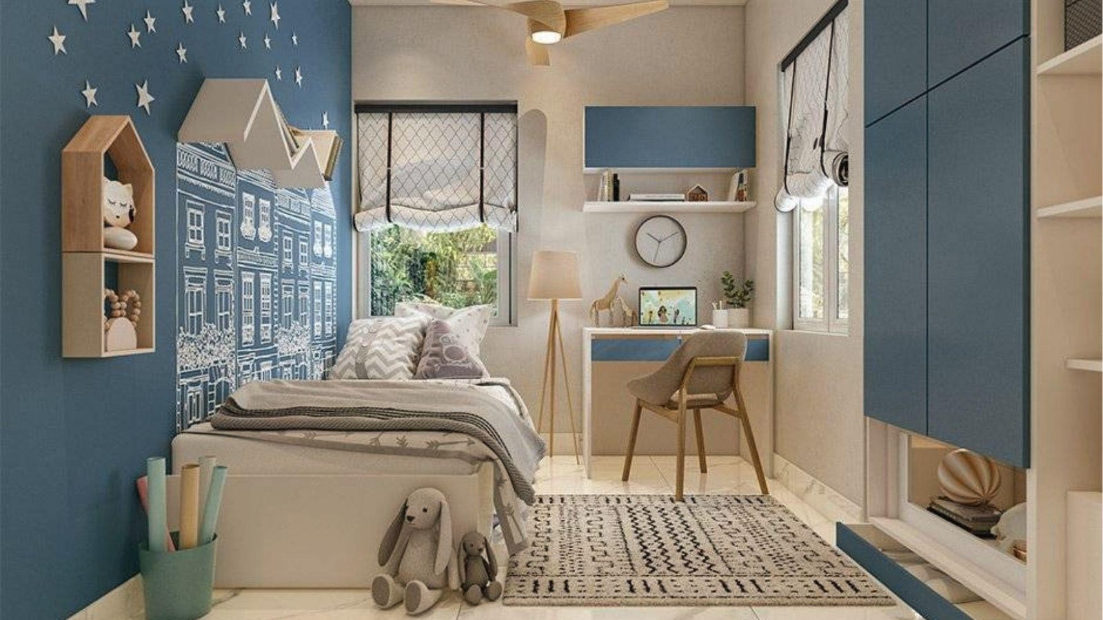
Fresh and clean. A gentle combo that suits most rooms and works with almost any furniture style.
Pale blue adds just enough color to prevent the space from feeling stark while keeping things open and calm. It is a reliable choice for bathrooms, nurseries, and smaller rooms.
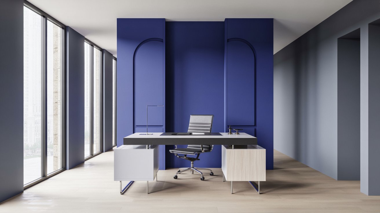
20. Royal Blue and Gray
Strong and modern. A great choice for home offices or living rooms where you want presence without drama.
The gray keeps royal blue from feeling overpowering, and together they create a sharp, confident look. Pair with chrome or steel accents to sharpen the overall finish.
21. Dusty Pink and White
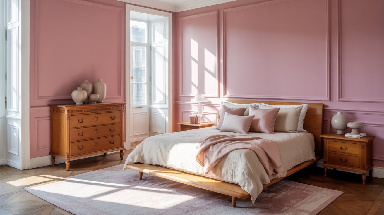
Soft and warm. This combo suits nurseries, bedrooms, and cozy living spaces where a calm atmosphere matters.
Dusty pink reads as mature and soothing rather than sweet, especially when paired with clean white trims. Layer in warm wood tones to add further depth to the room.
22. Mauve and Gray
Muted and refined. This works well in bedrooms and living rooms with neutral decor where you want warmth without strong color.
Mauve adds a quiet, rosy undertone that plain gray simply cannot achieve on its own. It is a pairing that rewards soft lighting and textured fabrics.
23. Blush Pink and Gray
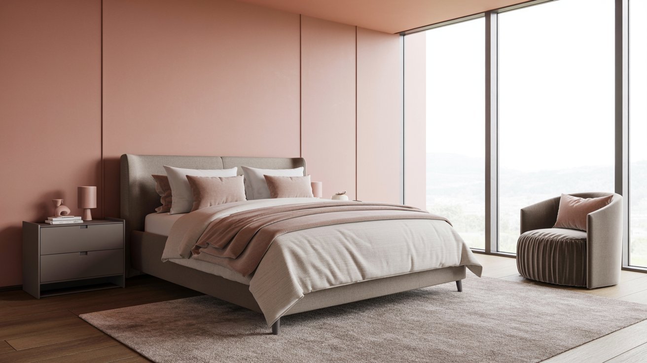
Soft and current. Works well in bedrooms and living spaces where you want something modern but still warm.
Blush keeps the palette feeling approachable while gray adds the restraint that stops it from feeling overly feminine. This combination holds up well beyond short-lived trends.
24. Wood and White
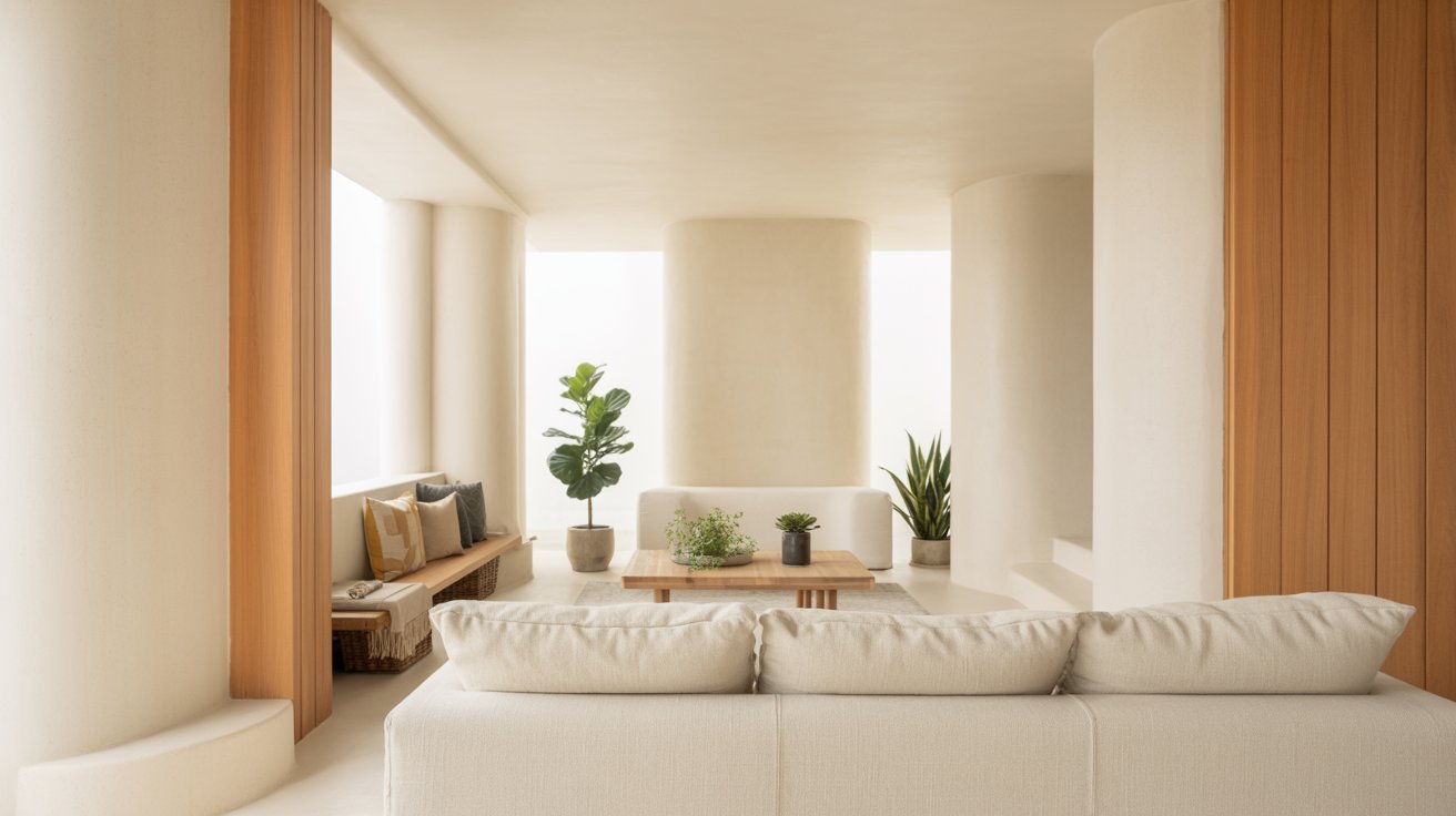
Warm and modern. Using wood-toned paint with white creates a cozy, natural feel that works in any room.
The contrast is soft rather than stark, making spaces feel relaxed and put-together at the same time. It pairs naturally with plants, linen, and minimal furniture.
25. Purple and Gold
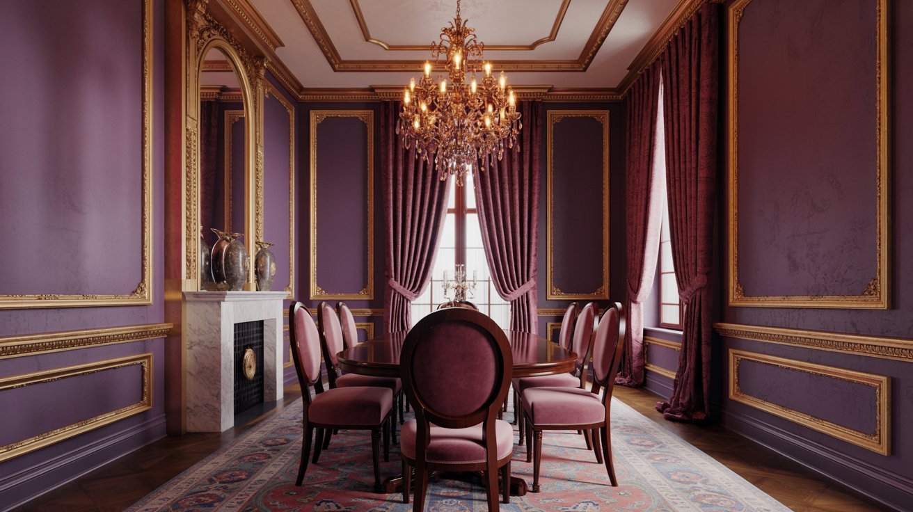
Rich and dramatic. Best used in spaces where you want a luxurious look that commands attention.
Deep purple walls with gold hardware or trim create a bold, confident atmosphere suited to formal dining rooms or statement bedrooms. Use it deliberately rather than throughout an entire home.
26. Wine Red and Black
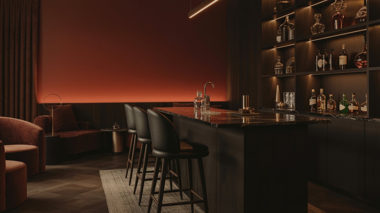
Bold and moody. Best for accent walls in dining rooms or home bars where a dramatic atmosphere is the goal.
This combination feels intimate and confident, especially under warm, low lighting. Keep surrounding surfaces neutral so the pairing does not overwhelm the space.
27. Green and Coral
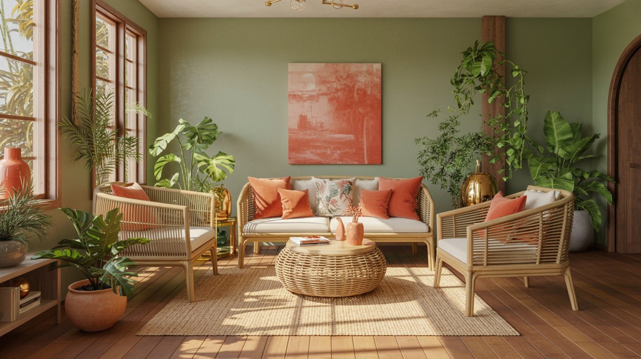
Playful and tropical. Works well in casual spaces or summer-influenced rooms that benefit from a lively, outdoor energy.
The contrast is vibrant but grounded, especially when both shades lean slightly muted. Natural light and rattan or wicker furniture bring out the best in this pairing.
28. Pink and Gray
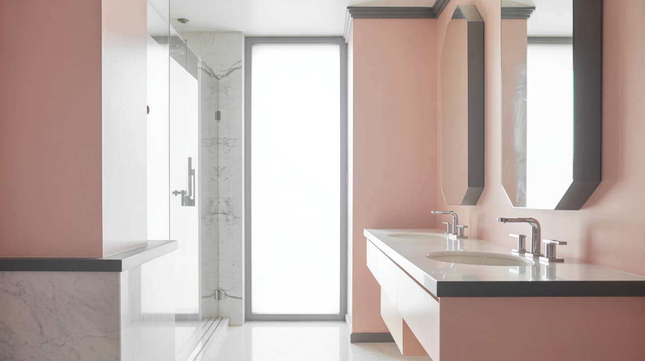
Soft and modern. Works well in bedrooms and bathrooms where a calm but polished look is the priority.
Pink adds just enough warmth to prevent gray from feeling cold or flat. This is a versatile pairing that suits both minimal and layered interior styles equally well.
29. Yellow and White
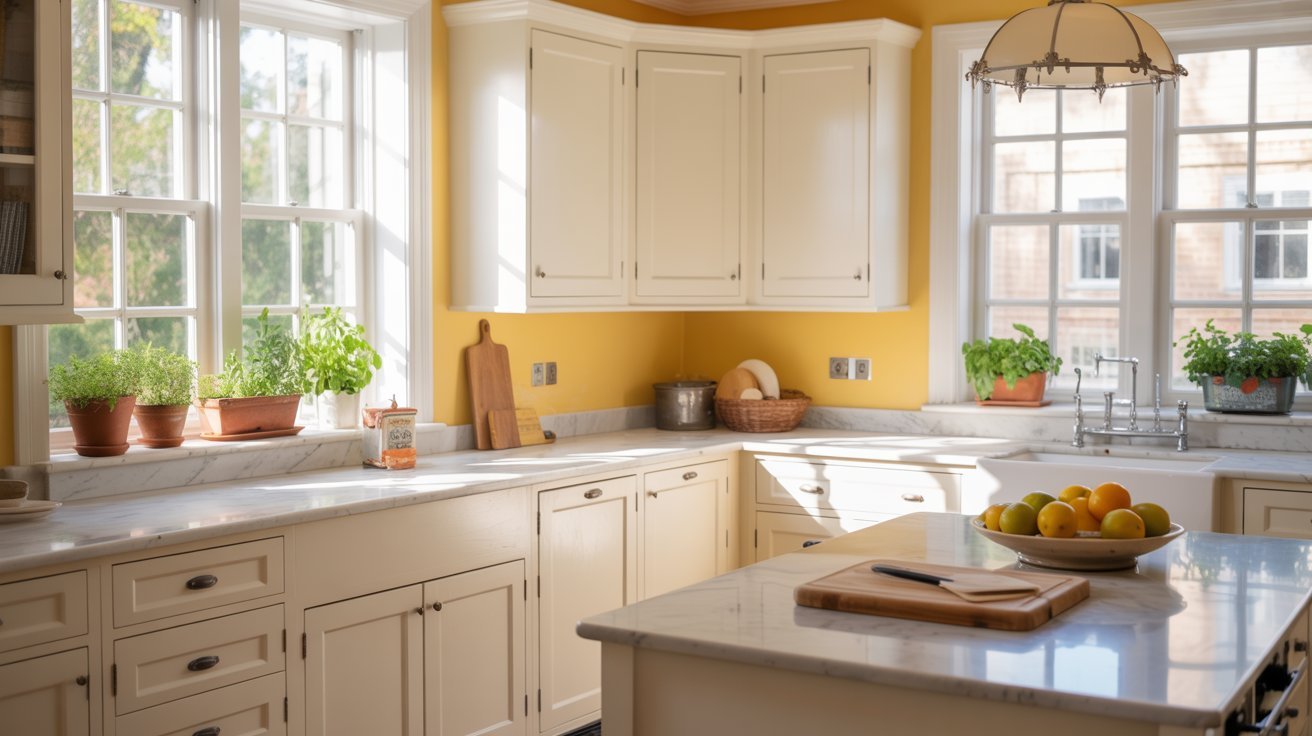
Cheerful and bright. Best for kitchens, playrooms, or any space that needs more light and a sense of energy.
Choose a warm yellow rather than a cool one to keep the combination from feeling clinical against white. It is one of the most reliably uplifting pairings in interior design.
30. Purple and Pink
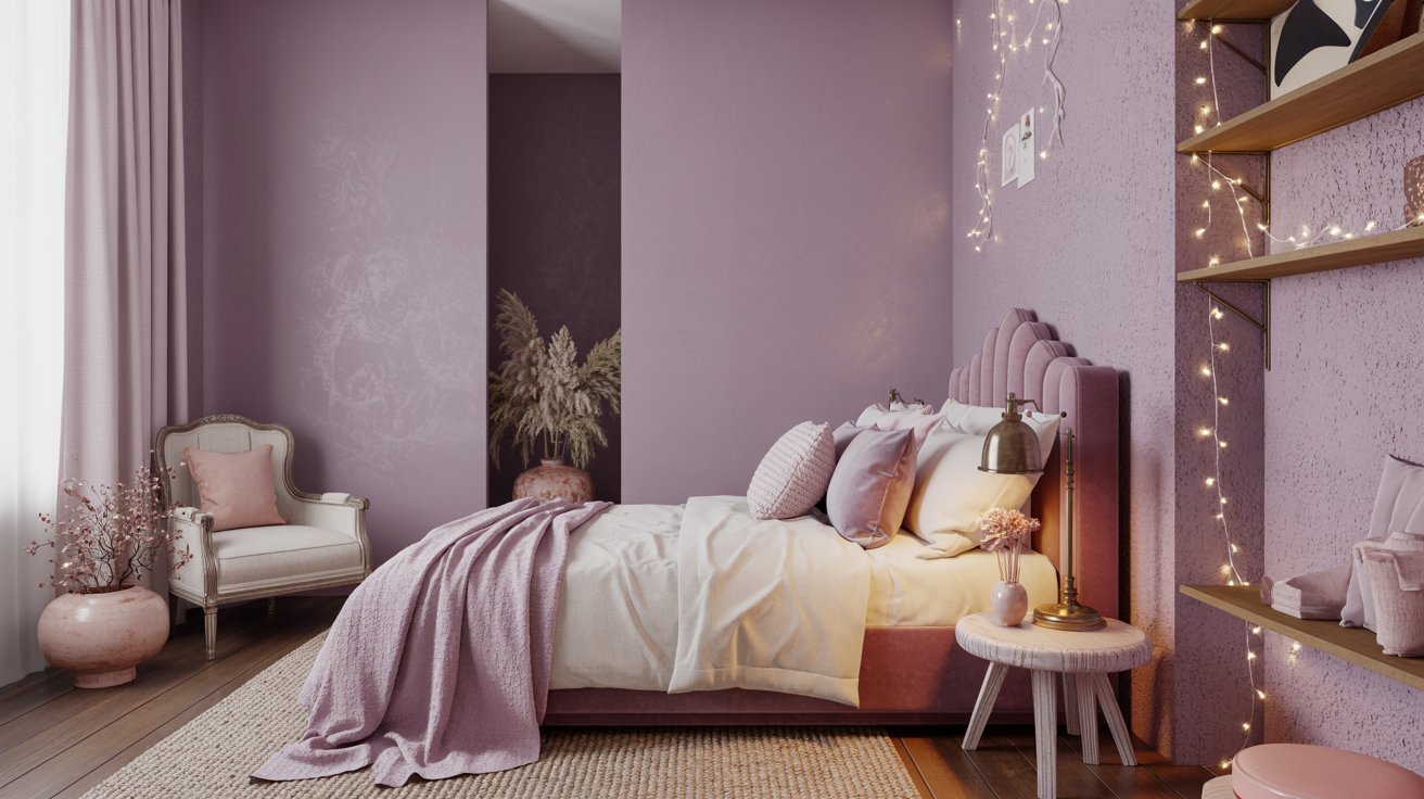
Soft and playful. Works well in girls' bedrooms or creative spaces where imagination and personality are the design brief.
Keep both shades muted or pastel so the combination feels considered rather than juvenile. Adding white trim prevents the pairing from feeling closed in.
31. Mint Green and Bubblegum Pink
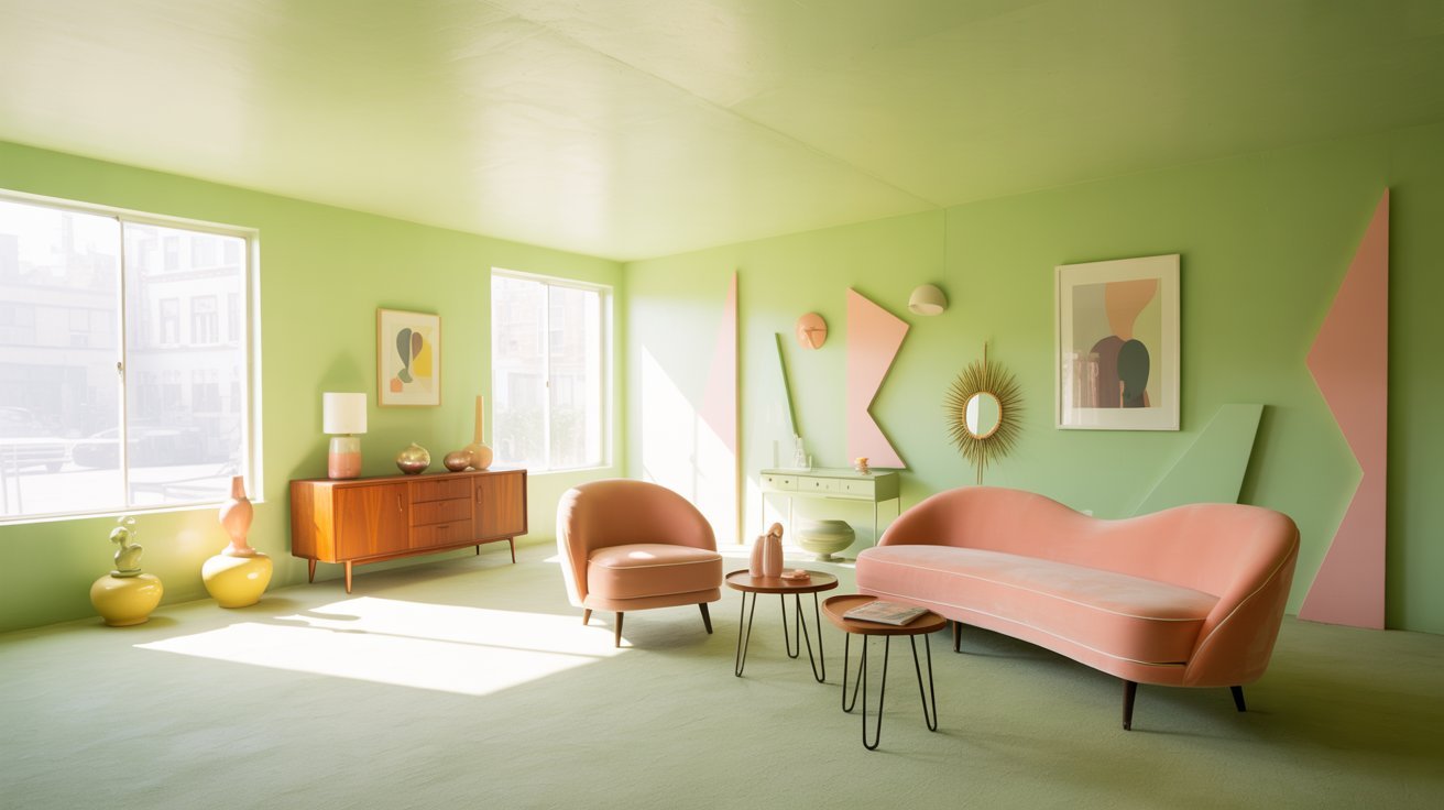
Fun and retro. Best for playful spaces or rooms with a lighthearted feel that leans into nostalgia.
The pastel combination nods to vintage design and works especially well alongside mid-century or pop-influenced furniture. Balance it with white surfaces to keep the room feeling fresh.
32. Charcoal Gray and White
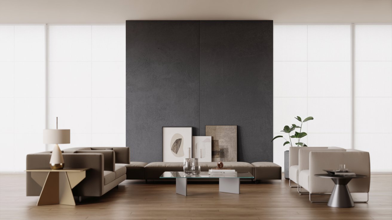
Modern and clean. Works in almost any room with any decor style, which makes it one of the most dependable combinations on this list.
Charcoal gives depth without the harshness of pure black, and white keeps things open. It is a timeless pairing that never feels overdone.
33. Monochromatic Gray Tones
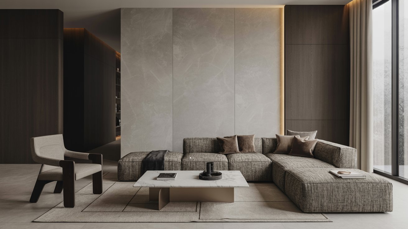
Layered and modern. Using two shades of gray adds depth without adding color noise to a room.
The tonal contrast creates subtle visual interest that reads as refined and intentional rather than flat or indecisive. It works in every room type and pairs with almost any accent color.
Expert Tips for Creating Two Tone Walls That Work
Small steps make a big difference when painting two tone walls.
- Use one dominant color on 60% of the wall, a second color on 30%, and a small accent on the remaining 10% to keep the room balanced and intentional.
- Paint the upper portion of your wall in a lighter shade to pull the eye upward and make the ceiling feel higher, especially in smaller rooms.
- Split one wall into two colors using a clean horizontal line and keep the remaining walls neutral to create a focal point without visual clutter.
- Pull one color from your existing rug, cushions, or curtains and use it on your wall to create a connected, finished look across the room.
- Use matte finish on upper walls to hide flaws and satin finish on lower walls for easy cleaning and everyday durability.
Conclusion
I hope these two tone wall paint ideas gave you real direction for your next project. I remember standing in my own living room, unsure what to do with a plain beige wall.
One coat of navy below and white above changed the whole feel of the space.
You do not need to overhaul your home to make a big impact. Sometimes, two colors are all you need.
If this helped you, share it with a friend or drop a comment below. I would love to hear which combo you are planning to try.
Frequently Asked Questions
Are Two Tone Walls Still in Style?
Yes, two tone walls are still very much in style. They have become a go-to choice for homeowners who want a polished look without major renovations.
What Are the Best Color Combinations for Two Tone Walls?
Some of the most popular combos include navy and white, sage green and gray, and charcoal with white. The best combo depends on your room size, light, and decor style.
Do Two Tone Walls Make a Room Look Bigger?
Yes, when done right. Using a lighter shade on the upper wall and a slightly darker tone below can make ceilings feel higher and rooms feel more open.
Where Should the Color Divide Be on a Wall?
The most common placement is at chair rail height, which is roughly one-third up from the floor. This feels natural and proportional in most rooms.
Which Rooms Work Best With Two Tone Walls?
Living rooms, bedrooms, hallways, and dining rooms all work well. These are spaces where you spend time and where the visual impact of two colors really shows.