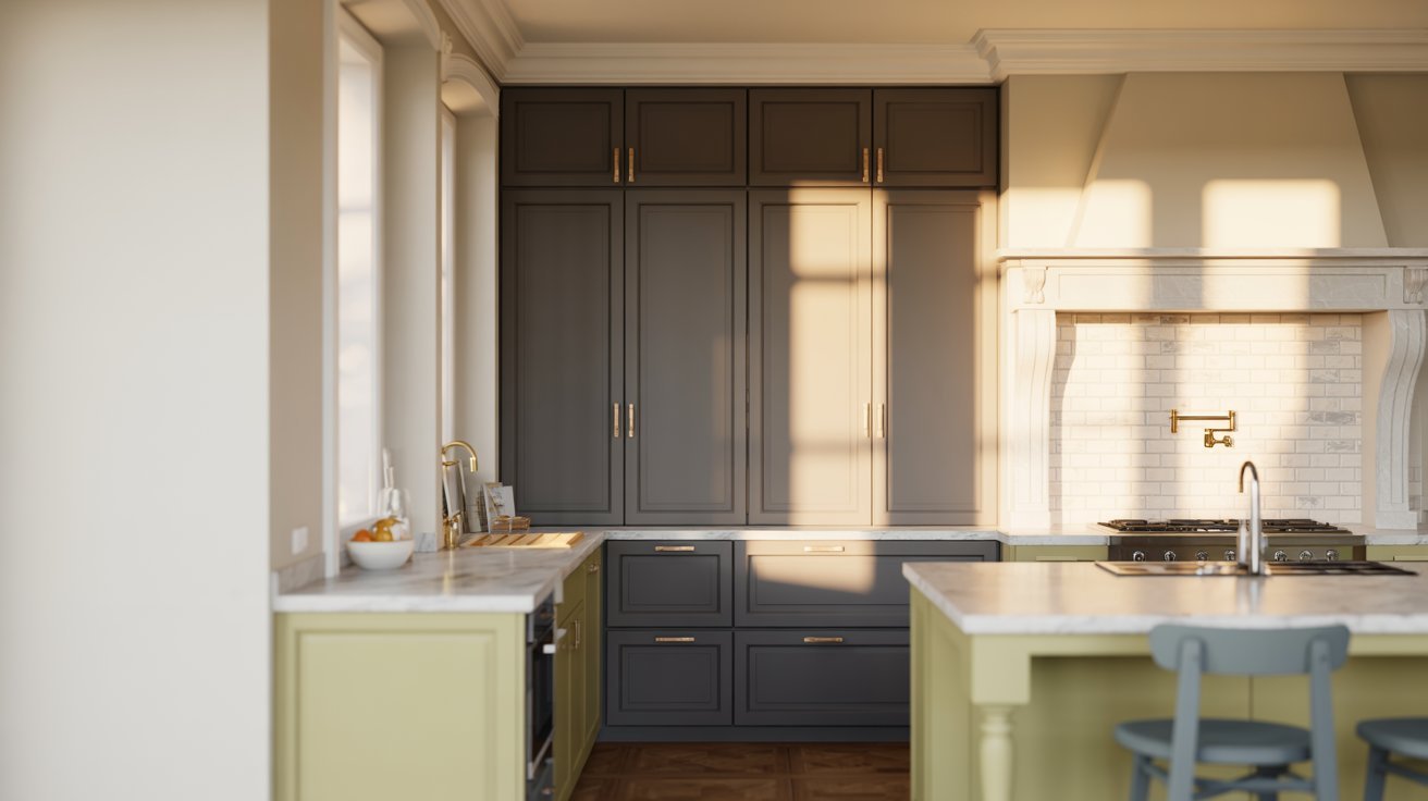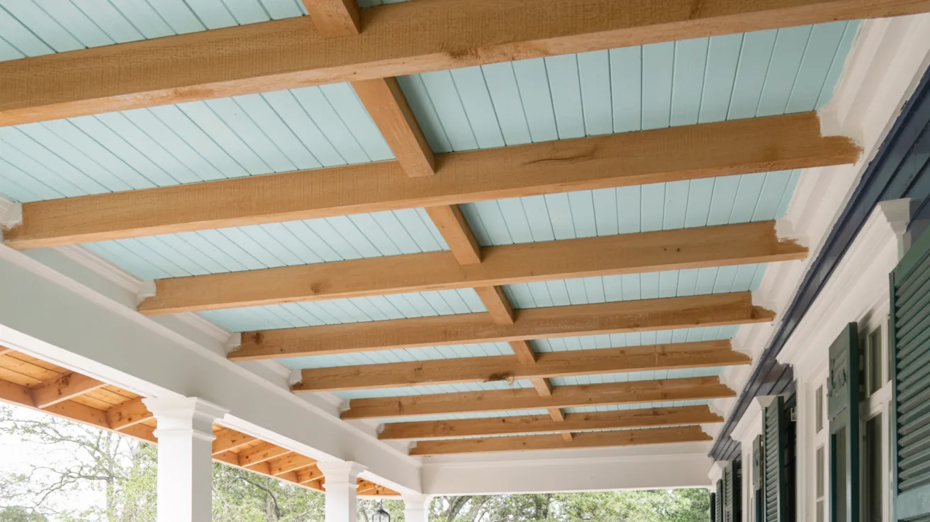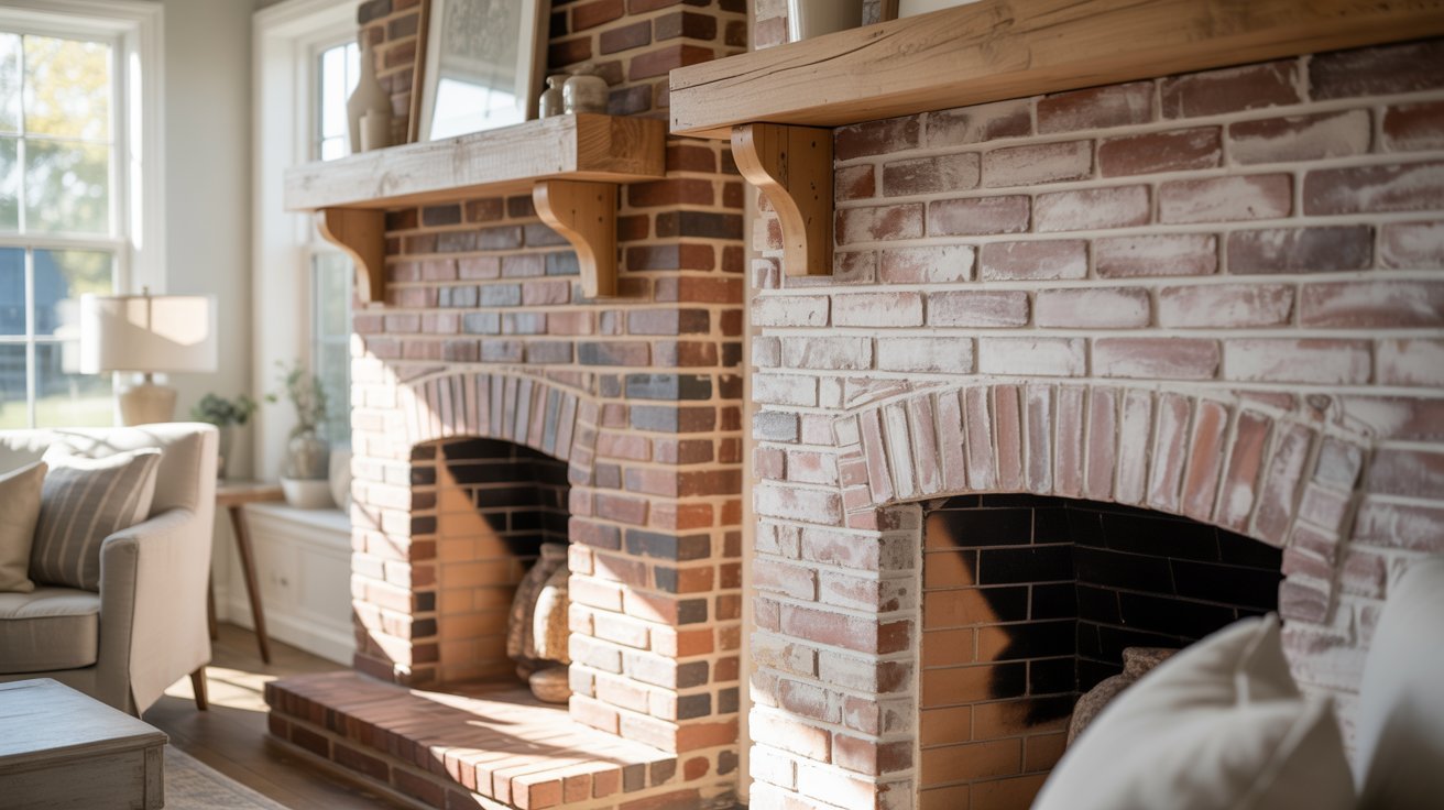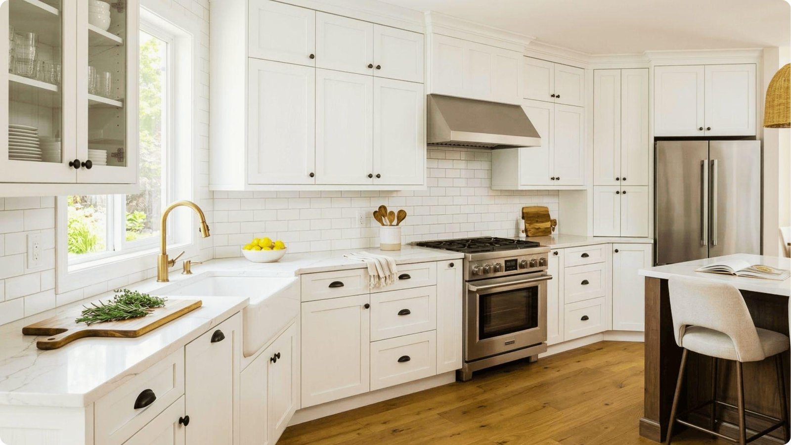
Oak cabinets can be tricky to work with. The warm, golden tones make it hard to pick the right wall color without clashing.
I have helped many homeowners work through this exact problem, and the right paint color makes a real difference.
This blog covers farmhouse kitchen paint colors that pair well with oak cabinets. You will also find tips on lighting, finishes, and how to test colors before committing.
Here is what you will find inside:warm whites, soft beiges, earthy greens, a guide on how to choose the right shade, and practical tips before you buy a single can.
How to Choose Farmhouse Kitchen Paint Colors With Oak Cabinets

Choosing the right paint starts with understanding your oak cabinets. Not all oak looks the same.
Honey oak has a lighter, yellow tone while golden oak runs warmer and more orange.
Warm paint colors like soft whites and beiges tend to work best because they match the wood instead of fighting it.
Cool grays can clash unless they carry warm undertones. Lighting also plays a big role. A color that looks perfect in the store can look completely different on your walls.
Always test paint samples in your kitchen and check them at different times of day before making a final decision.
21 Farmhouse Kitchen Paint Colors With Oak Cabinets
These tried-and-tested shades work well with the warm tones of oak cabinets in a farmhouse kitchen.
1. White Dove

White Dove by Benjamin Moore is a warm, soft white with just enough cream to keep walls from looking stark next to oak. It works well in kitchens with good natural light.
The warmth balances honey oak without making the space feel yellow.
2. Simply White

Simply White by Benjamin Moore is brighter than White Dove but still carries a warm base. It opens up darker kitchens without clashing with wood tones.
A solid choice for smaller farmhouse kitchens.
3. Shoji White

Shoji White by Sherwin-Williams sits between a white and a light beige with soft gray and green undertones. It works surprisingly well with warm oak tones.
A great pick if you want something beyond a standard white.
4. Alabaster

Alabaster by Sherwin-Williams is a creamy off-white with warm undertones that pair naturally with oak. It feels calm and grounded on the walls.
It does not compete with the wood but sits comfortably beside it.
5. Clunch

Clunch is a warm off-white with a slight clay tone popular in farmhouse-style homes. It gives walls a soft, aged look that fits the farmhouse feel well. Works best with lighter oak tones.
6. Accessible Beige

Accessible Beige by Sherwin-Williams has warm gray undertones that stop it from looking too yellow. It blends naturally with wood tones and feels very at home in a farmhouse kitchen.
One of the most reliable choices for oak cabinets.
7. Natural Linen

Natural Linen by Sherwin-Williams is a soft, warm beige with a hint of yellow. It gives the kitchen a cozy, lived-in feel. Works well if you want warmth without going too bold.
8. Canvas Tan

Canvas Tan by Benjamin Moore is a medium beige with warm undertones that add depth to larger kitchens. It pairs well with golden oak and earthy countertops.
A strong choice for kitchens with natural wood accents.
9. Edgecomb Gray

Edgecomb Gray by Benjamin Moore is a warm greige that leans more toward beige than gray. It reads as neutral without being boring.
One of those shades that just looks right with wood tones.
10. Revere Pewter

Revere Pewter by Benjamin Moore is a warm greige with gray and beige in equal measure. It has been a go-to for years in homes with wood cabinets.
Works well in kitchens with both warm and cool lighting.
11. Collingwood

Collingwood by Benjamin Moore is a soft greige with a slightly cooler tone than Revere Pewter. It has a quiet, understated feel that suits farmhouse kitchens well.
Pairs nicely with white trim and natural wood accents.
12. Pale Oak

Pale Oak by Benjamin Moore is a light, barely-there greige with just enough warmth to complement oak. It keeps walls feeling light and open without looking stark.
A great pick for smaller kitchens.
13. Repose Gray

Repose Gray by Sherwin-Williams is a popular warm gray with a beige base that prevents it from looking too cool. It pairs well with oak in warm lighting.
Test this one carefully as it can pull purple in cooler light.
14. Rainwashed

Rainwashed by Sherwin-Williams is a soft, muted blue-green that leans closer to gray than most blue-greens. It adds a hint of color without overwhelming oak tones.
It has a calm, relaxed feel that suits the farmhouse look.
15. Comfort Gray

Comfort Gray by Sherwin-Williams is a soft sage-gray with green undertones that balance the warm tones in oak. It sits in the middle ground, not too cool and not too warm.
One of the better cool options for oak kitchens.
16. Silver Gray

Silver Gray by Sherwin-Williams is a light, cool gray with just enough warmth to avoid clashing with wood tones. It gives the kitchen a clean feel while staying within the farmhouse style.
Pair it with warm lighting for best results.
17. Evergreen Fog

Evergreen Fog by Sherwin-Williams is a soft, muted sage green with gray tones that keep it calm and easy to pair with oak.
It feels grounded and natural on kitchen walls. A strong choice for a modern farmhouse feel.
18. Breakfast Room Green

Breakfast Room Green by Farrow and Ball is a soft, warm green with yellow undertones that match well with golden oak. It gives the kitchen a cheerful, garden-influenced feel.
Works especially well in bright, light-filled kitchens.
19. Dry Sage

Dry Sage by Sherwin-Williams is a dusty, muted green with gray in it that keeps it from feeling too earthy. It pairs well with natural textures and oak cabinets.
It fits the farmhouse look very naturally.
20. Paris Rain

Paris Rain by Benjamin Moore is a soft, cloudy gray-green with a quiet, understated quality. It works well in larger kitchens with good natural light.
A less common but very intentional choice for oak kitchens.
21. Down Pipe

Down Pipe by Farrow and Ball is a deep charcoal gray that creates bold contrast with oak cabinets. It works best in larger kitchens with light countertops and good natural light.
A striking choice for the modern farmhouse style.
Tips for Choosing the Right Farmhouse Kitchen Paint Color
A few simple steps before painting can save you from a costly mistake.
- Test paint samples on your actual walls and check them in morning, afternoon, and evening light before deciding.
- Always hold paint samples next to your countertops and backsplash to check for matching undertones.
- Stick to lighter shades for smaller kitchens and save deeper colors for larger, well-lit spaces.
- Choose timeless neutrals like warm whites and beiges over trendy colors if you plan to sell your home.
- Use peel-and-stick samples from brands like Samplize to test colors without the mess of painted swatches.
Conclusion
Picking the right paint color for a kitchen with oak cabinets takes a little patience, but it is worth it.
I remember staring at paint swatches for days before landing on the right shade, and once I did, the whole kitchen felt pulled together.
Go through the farmhouse kitchen paint colors listed above, test a few on your walls, and trust what you see. If this helped you, drop a comment below or share it with someone redoing their kitchen.
Frequently Asked Questions
What Is the Best Farmhouse Paint Color for Oak Cabinets?
Warm whites and soft beiges work best. Shades like White Dove and Accessible Beige complement oak without clashing.
Are Oak Cabinets Still in Style for Farmhouse Kitchens?
Yes. Oak cabinets have made a strong comeback. With the right wall color and updated hardware, they fit well in a modern farmhouse kitchen.
Should Farmhouse Kitchen Walls Be Light or Dark?
Light colors work best in smaller or darker kitchens. Larger kitchens with good natural light can handle deeper shades like charcoal or sage green.
What Color Countertops Look Best With Oak Cabinets?
White, cream, and light gray countertops create a clean contrast. Warm tones like butcher block also work well and keep the look cohesive.
How Do You Tone Down Orange Oak Cabinets?
Paint the walls in warm gray, soft sage, or earthy green. These shades draw attention away from orange tones without making them stand out more.